

05 Apr About a brand: La Gourmandise Chez Vous
Let’s talk about my first brand design of 2022: « La Gourmandise Chez Vous ».
You have surely noticed that I talk a lot about Branding 🙂
Because it should always be your starting point when launching your business.
About Branding
Branding gives your business an identity of its own, a distinct personality.
Branding helps you define your “why” or your purpose.
Branding is the visual but silent indicator of the kind of business you are.
It also gives consistency and clarity to your message.
Moreover, Branding gives your business an aura of seriousness and professionalism, inspires trust, and sets you apart from competitors in your industry.
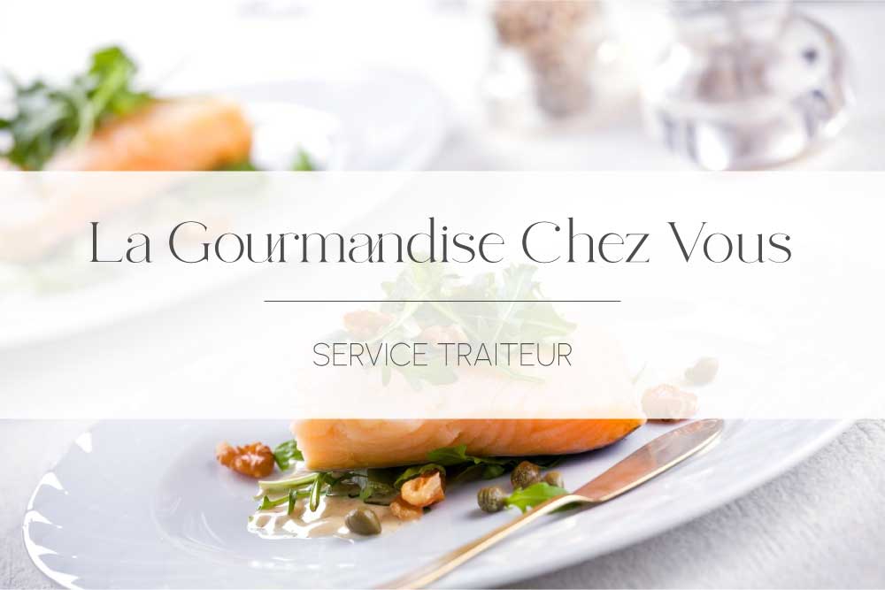
About A Brand: La Gourmandise Chez Vous
La Gourmandise Chez Vous is a catering service in Liège that you can hire for all your personal or professional events (brunch, cocktail, dinner, etc.).
Vicky (the owner) contacted me back in December 2021 for a rebranding.
She wanted a logo and visuals more aligned with her vision: pure, refined, elegant and tasty.
Her brand values are: “Quality, Beauty and Sharing”.
I must say I enjoyed putting all the pieces together to create a beautiful ensemble that gave life to her vision.
The Branding
The logo
![]()
The primary logo consists of the initials l – g – C – V, representing the brand name: “La Gourmandise Chez Vous”.
This logo is available in black, white, and two other colours, which I will describe later.
The submark

The submark is a variation or simplified version of the primary logo.
It is usually used on small media, allowing for a more complete visual identity.
For La Gourmandise Chez Vous, it is available in white and black.
The colours
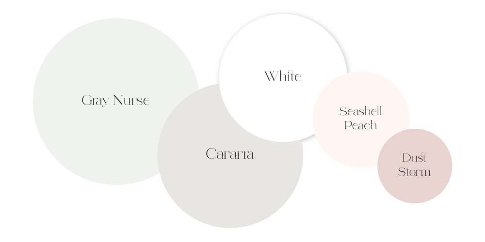
Colours are essential in every design project. They need to « work together » to enhance your work and offer a cohesive look to the ensemble.
Moreover, colour psychology theory explains how each colour is linked to a specific feeling, emotion and perception.
So the choice of colours for this rebranding needed to match the brand’s values.
Thus, I opted for a neutral yet slightly colourful palette to match the atmosphere of beauty and quality that the brand wants to radiate with its new look.
The typography
Abigail is the primary type I selected for the logo. It’s a « unique ligature font,» and I found that its skillfully placed tails and curves perfectly fit the purpose.
The secondary type, used for subheadings, body texts, captions and more, is a Google font named Urbanist. I appreciated the nice contrast created by this pairing.
The mood
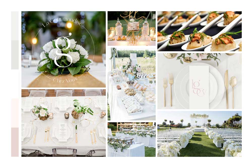
The overall mood of La Gourmandise Chez Vous needs to radiate beauty, elegance and refinement.
Indeed, the goal is for the audience to feel drawn by the quality of the visuals. This will later lead them to associate it with the quality of the products.
I put together a mood board to inspire, impress, and create a need to touch the fabrics and textures, smell the scents, and taste the food.
The goal
As I have said before, your brand includes what your audience can see and how you make them feel, the visual and the abstract.
Branding aims to spark specific emotions into the hearts and minds of your target audience.
Once you have defined that audience and know who your ideal client is, the strategy is to address them using the proper tone.
Indeed, people are more likely to buy from a brand they connect with emotionally.
In conclusion
This rebrand is one of the best I have created so far 😊
From the logo and submark to the colours and typos, the whole atmosphere around the brand radiates elegance and style.
Once more, I achieved the « Wow » effect by designing a brand my client is thrilled to show off.


No Comments