


Let’s talk about a brand I really enjoyed designing: « Brown T », a marketplace that targets modern, independent Afro-descendant women who take care of themselves.
In this series, I describe the process behind the brand design for small businesses that trusted me and my creativity to bring their vision to life.
About Branding
“A good definition of branding is the considered intent for the positive role a company wants to play in the lives of the people it serves and the communities around it.”
— Neil Parker
Branding is a prominent part of your marketing strategy, as it helps you visually introduce yourself to the public when you first start your business.
Your brand influences every aspect of the public’s perception of your company. Having brand guidelines in place builds trust, recognition, loyalty and reputation.
In the long run, it also ensures that your brand remains in your audience’s memory.
About A Brand: Brown T Marketplace
Brown T is a marketplace promoting Afro-feminine know-how in clean cosmetics and fashion.
They want to create a circular economy in the Afro community in Europe and elsewhere.
They aim to promote and enhance female entrepreneurship and the genius of black/mixed-race women.
The Branding
The logo
![]()
The primary logo consists of the brand name: “Brown T” and the word “MARKETPLACE” as a baseline.
It can be utilised in three of the five colours of the brand palette and placed on various coloured backgrounds.
The submark

The submark is a variation or simplified version of the primary logo.
It is usually used on small media, allowing for a more complete visual identity.
For Brown T, the submark consists of a combination of a capital “B” and a small “t” placed in a round brown circle 😉
The colours
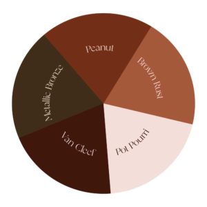
Based on colour psychology, each colour has a meaning and can project specific messages and feelings onto your audience that will affect daily decisions. So, by studying colours and using them accordingly, you can make people “feel” a certain way about your brand.
The colours chosen for Brown T Marketplace are warm and luxurious, reminding us of the different shades of black and brown skin.
The typography
Zephyr is the primary type I selected for the logo and the headings in documents and visuals.
It’s a « modern serif font,» a mix of old and new, with soft curves and high-contrast glyphs.
The secondary type, used for subheadings, body texts, captions and more, is a Google font named Lato. Again, a nice contrast between fonts is the key to a good font pairing.
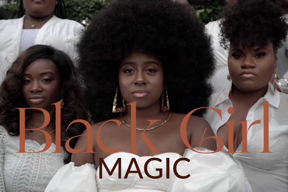
The mood
The overall mood of the brand is centred around the empowerment and upliftment of Afro-descendant women.
Brown T Marketplace wants to encourage black women’s economic, social, and cultural development.
So, the imagery must draw the audience to the various facets of « black girl magic ».
The goal
Branding in marketing aims to build trust and loyalty among your customers. Your brand provides a way for your customers to remember you, create an identity for your company, and distinguish it from competitors.
I know I have said this countless times, but having a good branding strategy in place will help you clearly define:
- your brand purpose: “why” you exist;
- your brand values: the qualities you aspire to as a company;
- your brand mission: what you need to do to achieve your goals;
- your brand vision: where you hope to be if you stick to your purpose, values, and mission.
In conclusion
Brown T wants to cater to the business needs of Afro-descendant female entrepreneurs by offering a platform that will increase their visibility.
I’m happy that they chose YY Webdesign to give life to their brand, and I must say I loved working on this project 🙂
And as I often say, investing in good branding will always pay off.
It’s time to invest in your brand!

1 Comment
M.
Posted at 12:35h, 22 JuneHey 👋🏾 I’m one of their clients! I didn’t know you were the designer 😊🔥