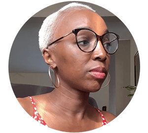
Creating a brand should always be a delightful and enriching experience, like when I worked with La Distinction.
About Branding
Getting to know the brand owner is an essential step in the branding process. I always develop a more personal relationship with my clients to better understand their needs.
I created a branding questionnaire, in addition to the discovery call, to assist my client in writing down their feelings about their brand.
I ask them to describe their mission, vision, values, and anything else I need to create visuals that perfectly fit their needs.
About A Brand: La Distinction
La Distinction is a fashion and styling house founded in 1983 in Kinshasa (Zaire).
At its head, you will find Maleki, an experienced and inventive stylist with fairy fingers and ideas to spare.
After almost forty years of existence and ten years online, we decided to give the brand a better, more contemporary look.
The Branding
The logo
The logo is a logotype (or wordmark). It consists of the company name written in all caps, adorned with the brand owner’s nickname in script font, and slightly tilted as if it were a comma.
It comes in white and black.
The symbol

The symbol is an abstract drawing of the brand owner wearing a headscarf with her hand on her hip. It was drawn by a family member some 40 years ago.
I scanned it to be able to use a vector version.
It comes only in white on a black square or round background.
The colours

As its name suggests, La Distinction wants to stand out, to “distinguish” itself from everything usually done.
The brand wants to be innovative and original in its creations.
So I chose a palette that compliments her the best, with neutral colours and a little bright touch.
The typography

Fonde is the primary type I selected for the headings on the website, in documents and in visuals.
It’s an elegant and chic serif font that fits the brand vibe.
The secondary type, used for subheadings, body texts, captions and more, is a Google font named Raleway, an elegant sans-serif typeface.
Font pairing is essential for visual hierarchy and contrast between all written elements.
The mood

The overall mood of La Distinction is about creativity and uniqueness. The brand wants to be innovative and original in its creations.
They love mixing fabrics and styles to create colourful yet classy outfits.
The goal
A well-designed image gives an aura of professionalism to your brand.
As previously stated, your brand includes what your audience can see and how you make them feel visually and abstractly.
It’s important to remember that people are more likely to purchase from a company with which they have a personal connection.
Branding elicits specific feelings and thoughts in people’s hearts and minds.
In conclusion
Branding is where everything starts for your business.
It is refreshing when your client understands that branding includes beautiful visuals as well as a good strategy. For a successful business, one cannot exist without the other.
The visuals will attract your ideal client, and the strategy will make them always return.


No Comments