


The Challenge
The clean beauty market is saturated with brands promising purity but few actually deliver precision. Most brands compete on the number of steps in a routine, not the effectiveness of each step.
Veraniy needed to occupy a position between two worlds that rarely meet. Pharmaceutical brands treat where beauty brands adorn. Neither speaks to the active woman who wants both: real efficacy and a formula she can trust on her skin without complicating her routine or compromising her values.
Without a clear architecture, the brand risked reading as “just another clean beauty line” lost among products that all claim to be natural but don’t prove it.
The Strategy
Rather than layering identity onto an existing product line, we started the work at the foundation. We built a naming and positioning system to hold every future decision, then a visual and verbal language to carry it.
1. Naming and product architecture
The product line, Xeraniy, was built on its own internal logic: xera, for dry skin, and aniy, for simple and minimalist. The name itself becomes a promise before a single product is seen.
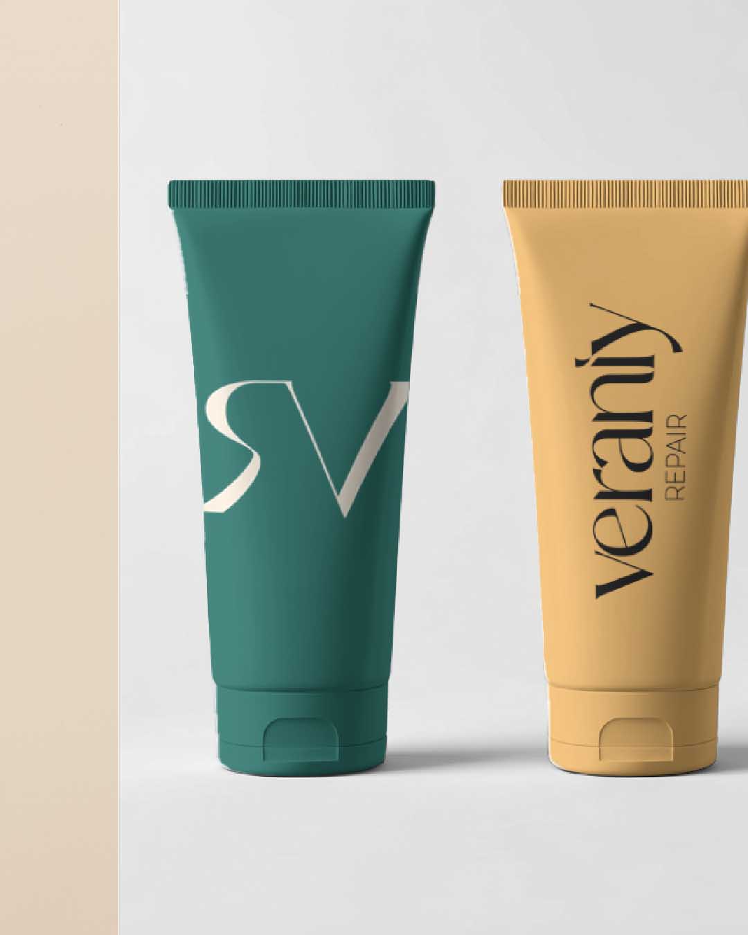
Each product was scoped with a distinct, deliberately narrow role rather than a sprawling range: a cleansing oil, a body balm and a targeted face treatment. Skinimalism is the actual structure of the offer: three products with clear jobs.
2. Visual identity
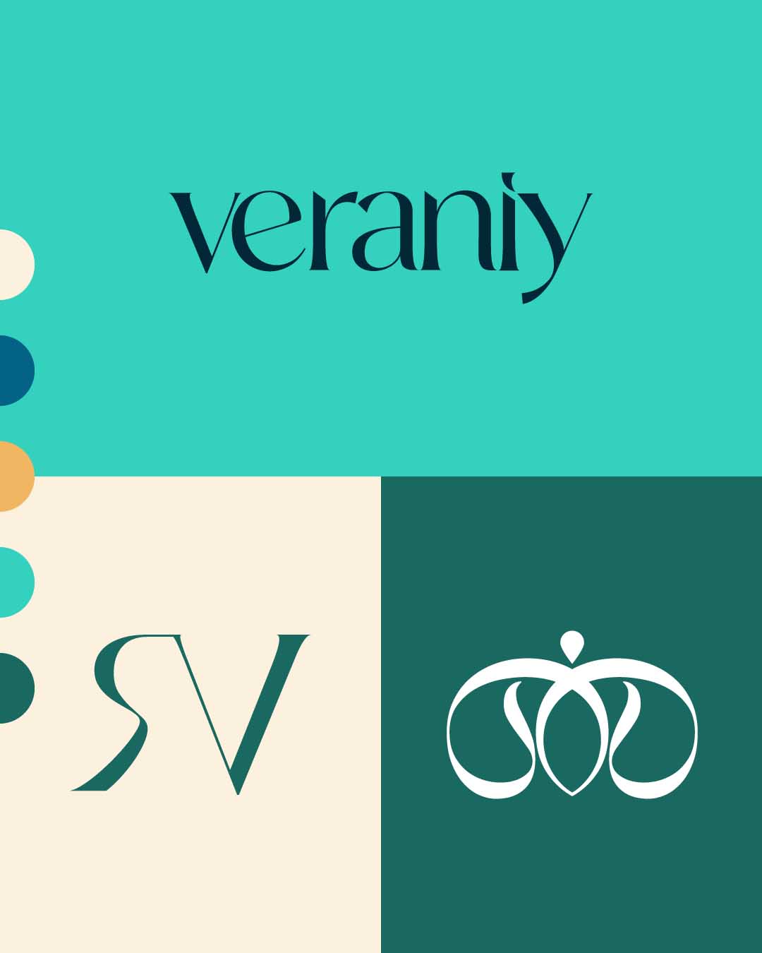
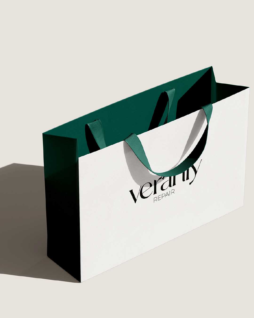
The identity had to carry the same tension as the positioning: warmth and clinical rigor in the same breath. The logotype pairs an elegant italic serif for “veraniy” with a small geometric capital for “REPAIR,” letting the two sides of the brand sit visibly side by side.
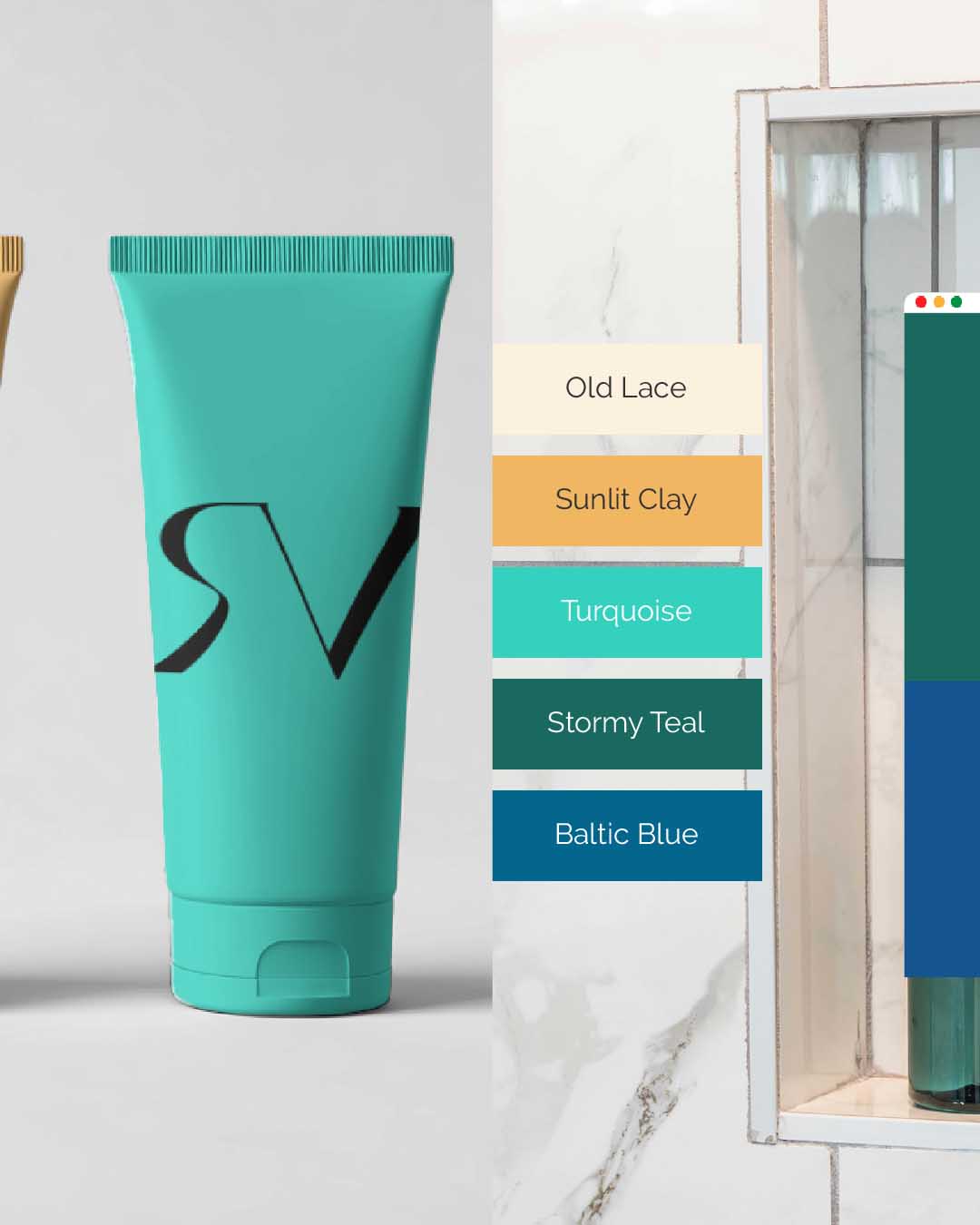
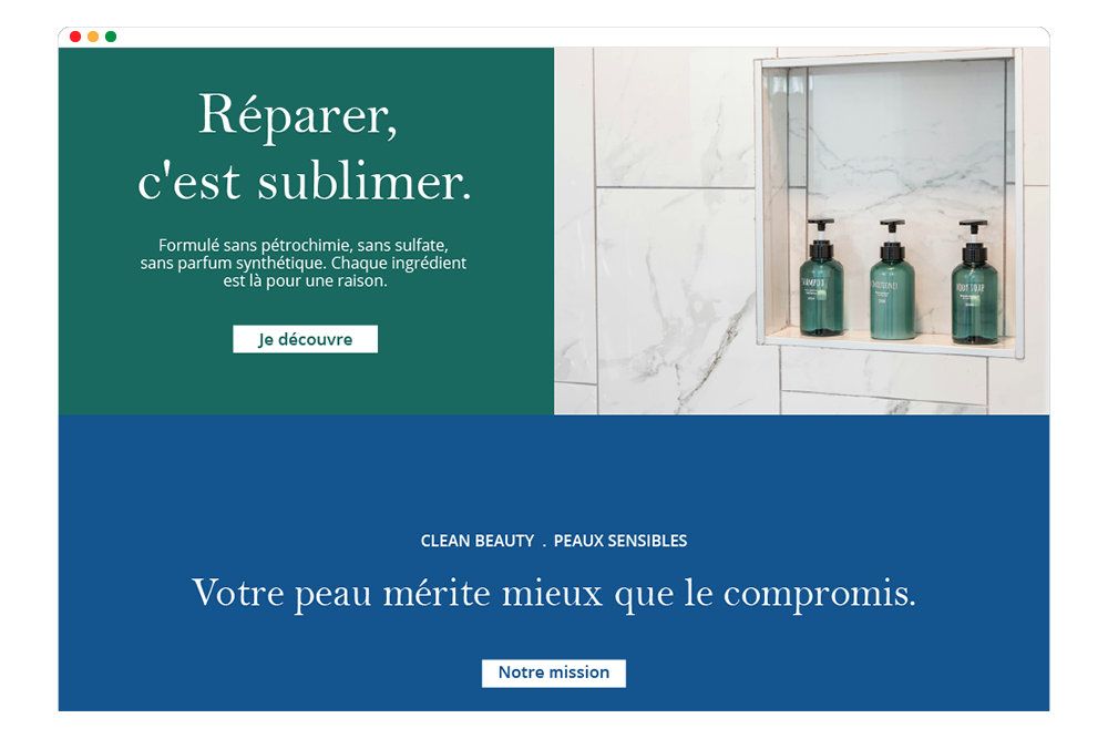
The palette moves between soft, warm neutrals and grounded greens and blues. The colors are close enough to nature to feel honest and structured enough to feel credible.
Typography follows the same logic: an organic serif paired with a clean and precise sans-serif so every touchpoint reads as both human and exact.
3. Website and content
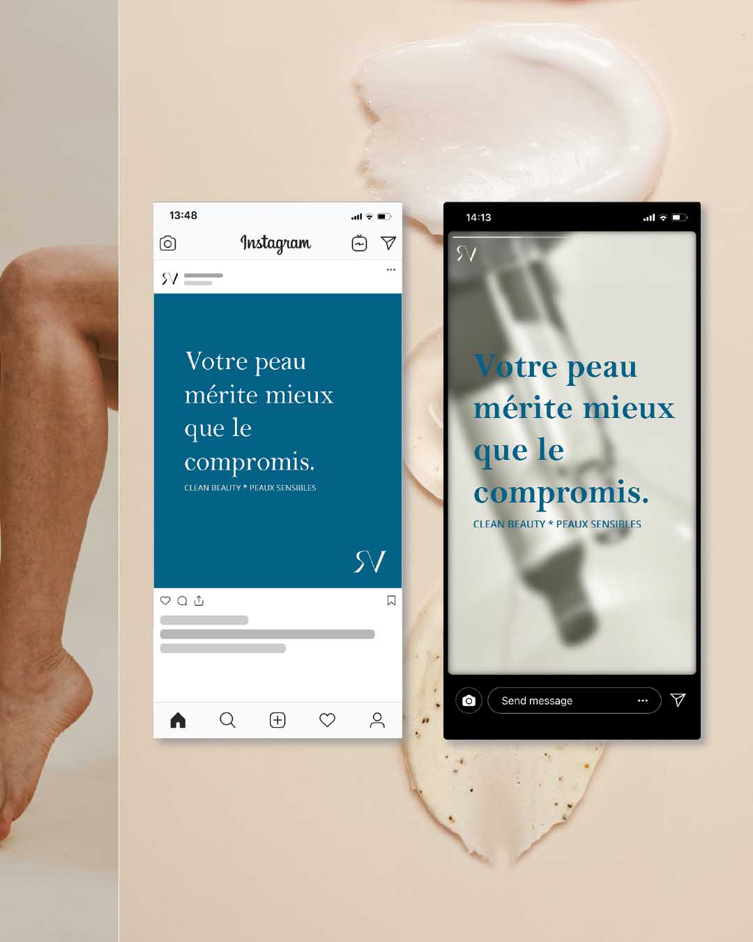
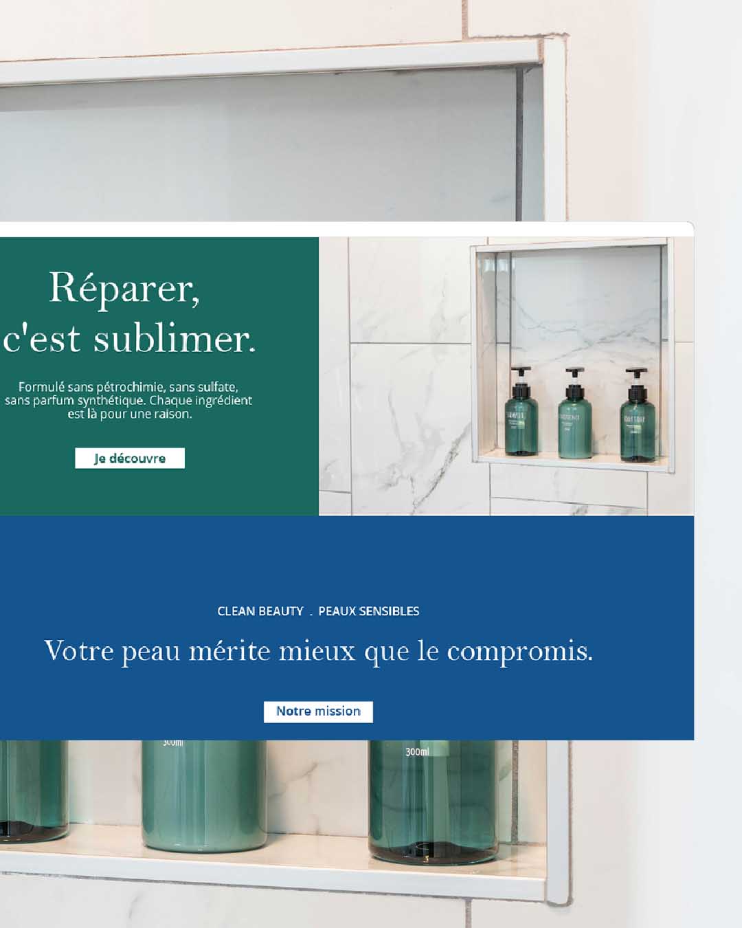
The site and product content (coming soon) have to do real work beyond aesthetics: carry the brand’s safety and regulatory realities without ever feeling clinical or cold. Formulation differences between products, including age and pregnancy considerations, are built into the copy itself.
I built the brand’s newsletter as an editorial extension of the same philosophy: no noise, no over-explaining, just what matters.
The Result
Veraniy Repair now has a foundation built to grow on, to evolve as the years pass. The brand has a name that means something, a product architecture reflecting its philosophy and a visual identity holding warmth and precision at the same time.
Veraniy Repair ignores volume and competes on clarity.