

The Challenge
NRS Thérapie had already done the foundational work. The brand carried real depth, a clear purpose and genuine intention. But depth alone doesn’t create impact without coherence.
The visual language had grown misaligned with the practice’s sensitivity. Typography, colour and structure were each pulling in slightly different directions, creating an overall impression that felt approximate rather than grounded.
For a brand operating in the fields of therapy, embodiment and transformation, that gap mattered.
Clients need to feel safe, held and in capable hands before they ever book a session.
The Strategy
Rather than a full rebrand, the work called for precision. I approached each element of the identity methodically, strengthening what was already there and building what was missing.
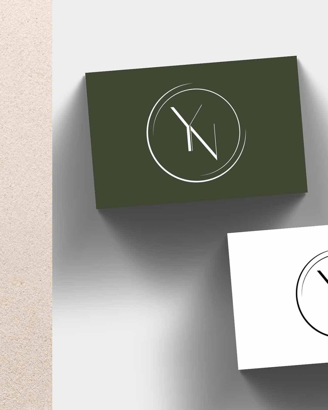
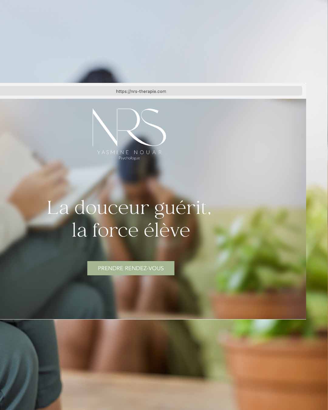
1. Logo Suite design
The original brand had a single logo, which limited how flexibly the identity could be used across different formats and contexts.
I expanded it into a full logo suite by designing a stacked variation for more compact applications and two monograms to serve as standalone marks, giving the brand the versatility it needed to show up consistently at every touchpoint.
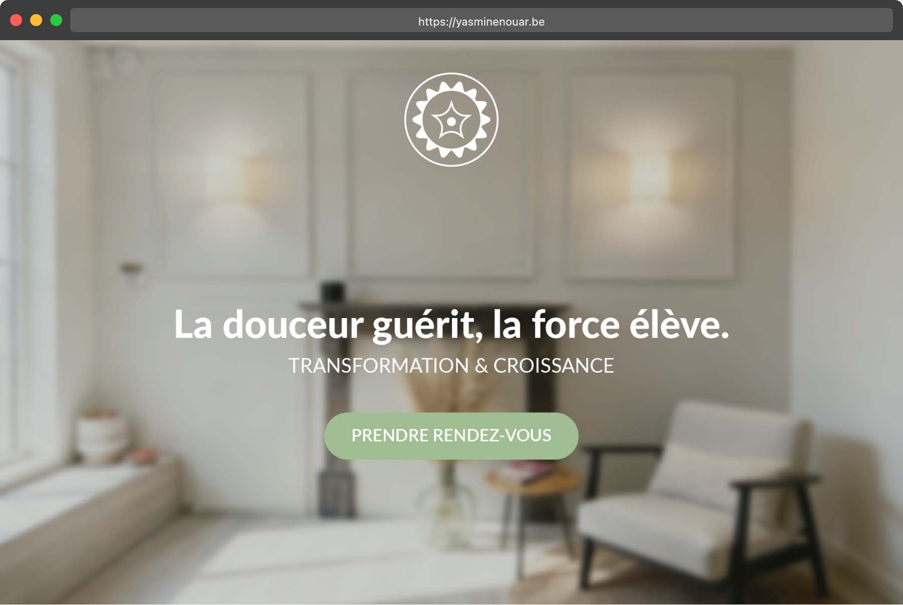
2. Font pairing
For typography, I built a dual-system pairing a serif with a sans-serif. The serif brings structure and authority, signalling a practice that is serious and grounded.
The sans-serif handles clarity and readability, keeping the tone approachable and human. Together, they create a visual language that feels both professional and warm, which is exactly the balance a therapy brand needs to strike.
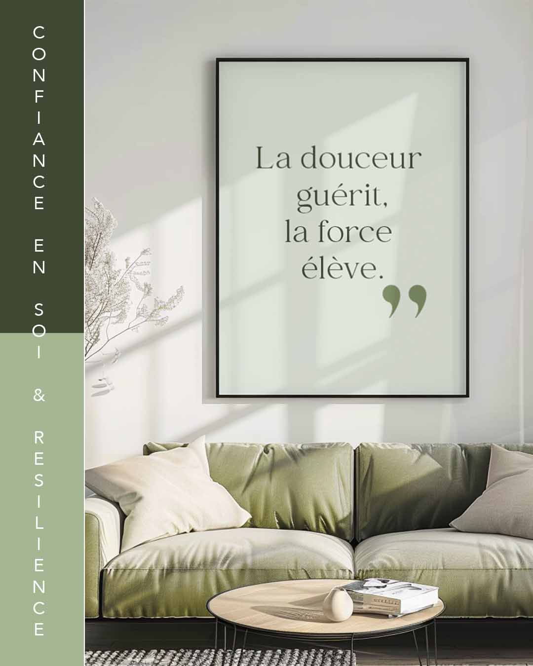
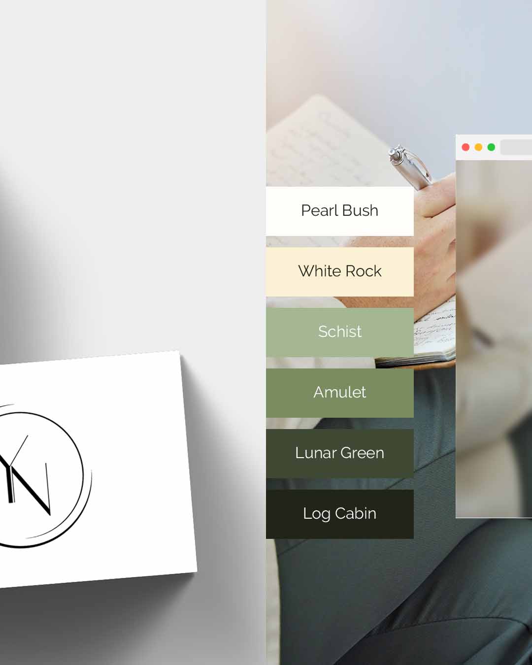
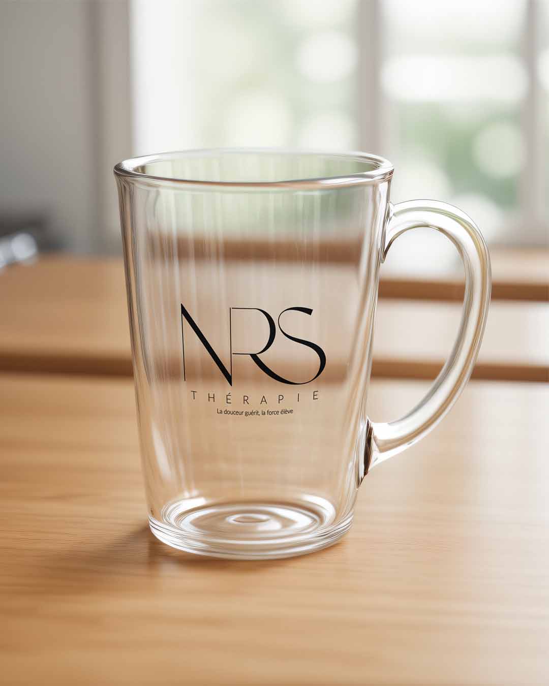
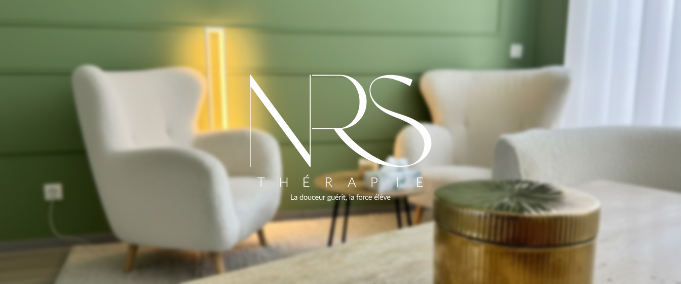
3. Colour palette
The colour work went beyond adjustment. I shifted the palette’s overall mood and introduced new accent colours to add more intentionality to the brand’s visual communication.
The refined palette now feels cohesive and considered, soft enough to feel safe but structured enough to feel credible.
The Result
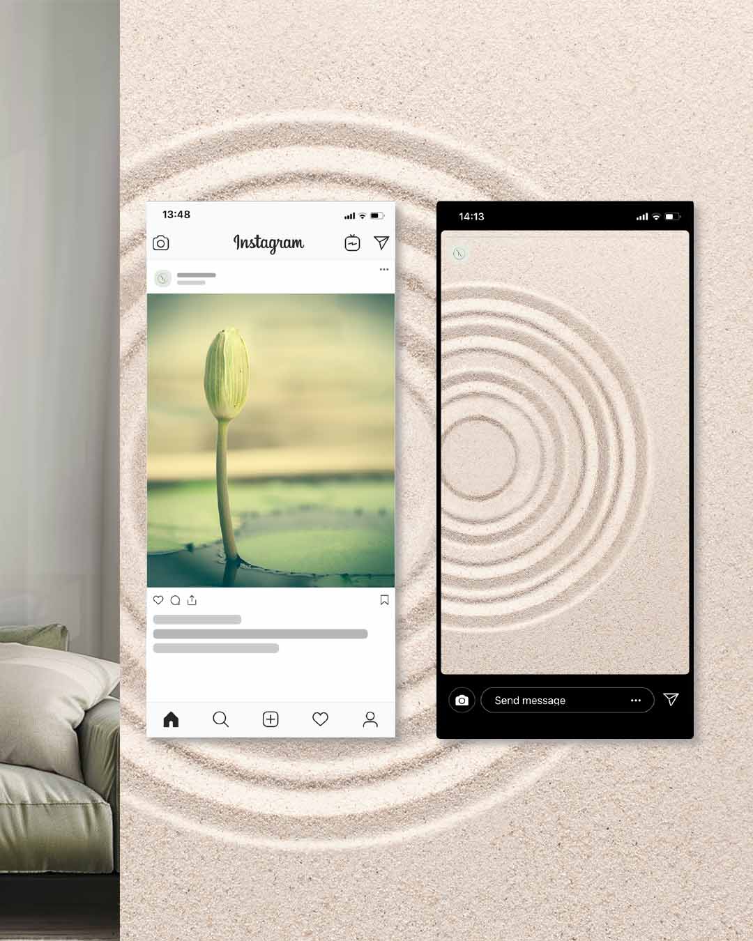
NRS Thérapie now has a visual identity that reflects the quality and intentionality of the work it stands behind. The brand feels cohesive, professional and emotionally safe, qualities that build trust in a therapeutic context.
With a stronger foundation in place, it can grow and communicate with confidence, without needing to explain itself.