

The Challenge
The previous website felt amateurish and visually chaotic. More importantly, it did not support the school’s growth.
Several key issues emerged during the audit:
- No cohesive branding: The school relied mainly on the colours of the Congolese flag, without a structured brand identity aligned with its new strategic direction.
- No clear subscription system: Parents had no streamlined way to register their children.
- No clearly defined target audience (segmentation of the offer by age or educational level).
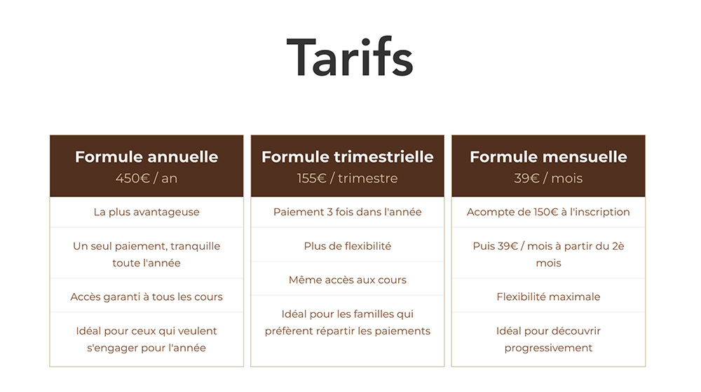
- No pricing transparency
- No structured communication hub
- No newsletter system
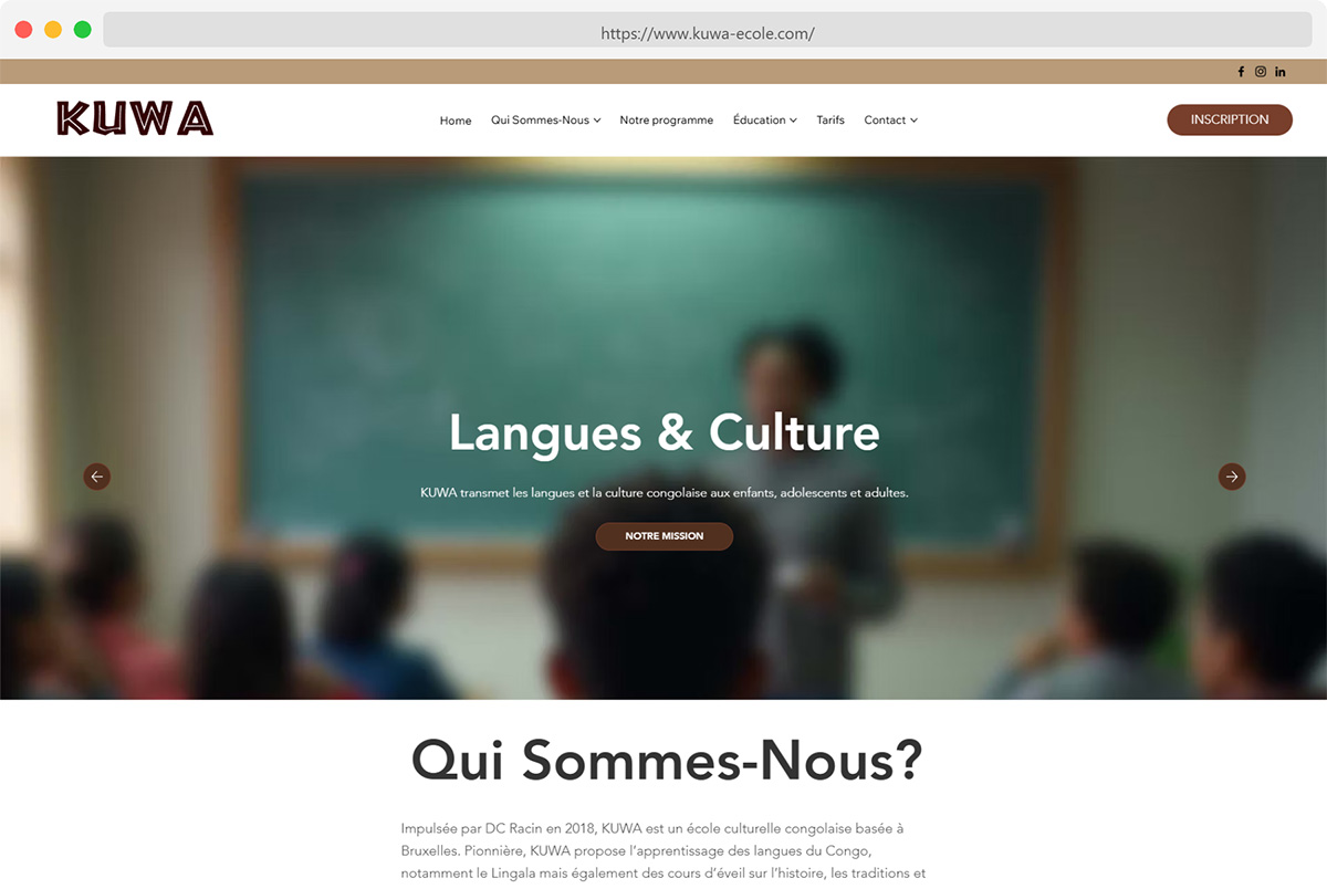
The website existed but it wasn’t functioning as a decision-making tool.
The Strategy
We approached this project holistically, not as “design” but as positioning.
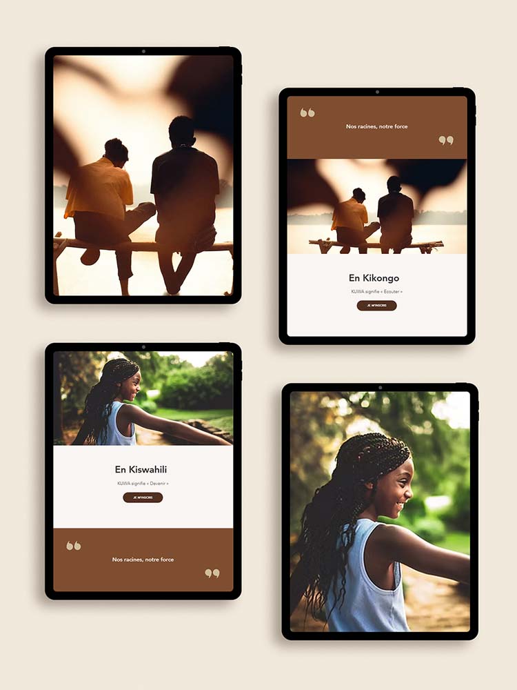
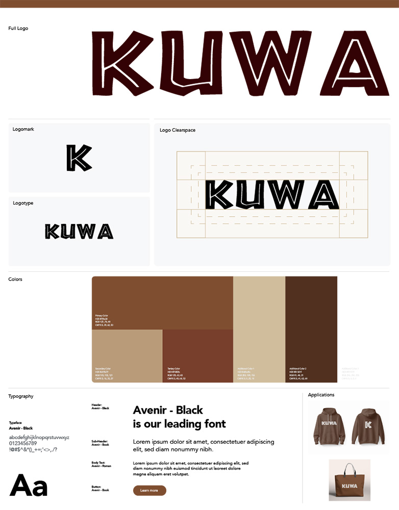
1. Brand Elevation
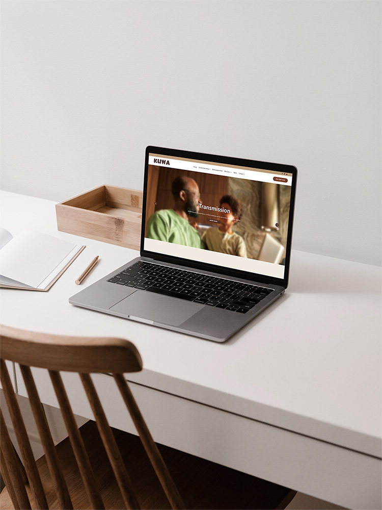
The first step was to refine KUWA’s visual identity.
- I simplified the logo to create a cleaner, more professional mark.
- I upgraded the typography to Avenir, a typeface that balances modernity and clarity.
- I redefined the colour palette to move away from an informal use of national colours toward a more intentional, structured brand system aligned with KUWA’s new face.
The goal was simple: maintain cultural pride while elevating perceived professionalism.
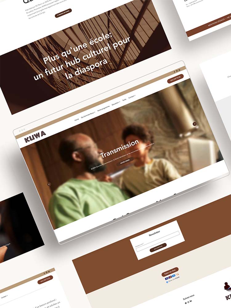
2. Structural Clarity
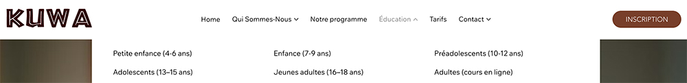
We restructured the entire website architecture.
A new “Education” section was introduced, clearly defining age groups and educational objectives for each level. This immediately helped parents identify where their child belonged.
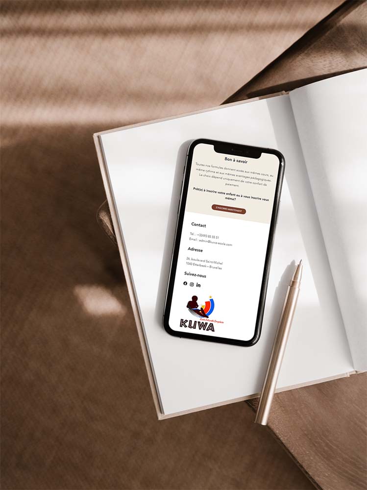
I created a dedicated “Prices” page to ensure full transparency. Clear pricing builds trust and trust builds enrollment.
3. Operational Efficiency
To solve the subscription issue, we integrated MyScol, a professional school management system.
This upgrade enabled KUWA to transition from manual processes to a structured enrollment system, improving both the user experience and internal organisation.
4. Communication & Growth
We designed a “News” page to centralise upcoming events and school updates.
I activated a newsletter system to keep parents and the community informed about:
- New registrations
- Cultural events
- Educational developments
- Institutional announcements
We transformed the website from a static platform into a living ecosystem.
The Result
KUWA now has:
- A professional, cohesive brand identity
- A structured and intuitive website
- Clear target segmentation
- Transparent pricing
- A streamlined enrollment process
- A communication system that supports long-term growth
The transformation wasn’t cosmetic but strategic.
The website now reflects the institution’s seriousness and supports its mission of cultural transmission with clarity and authority.